Java Kirana Brand Identity: A Fresh Take on Coffee
Java Kirana
Java Kirana is a coffee company rooted in purpose, empowering Indonesian smallholder farmers through technology-backed processing, sustainable practices, and transparent supply chains. The brand bridges traditional farming with modern innovation, creating impact both at origin and in every cup.
The goal was to design a visual identity that breaks away from conventional coffee branding, while capturing the brand’s values: nature, growth, and ethical sourcing.
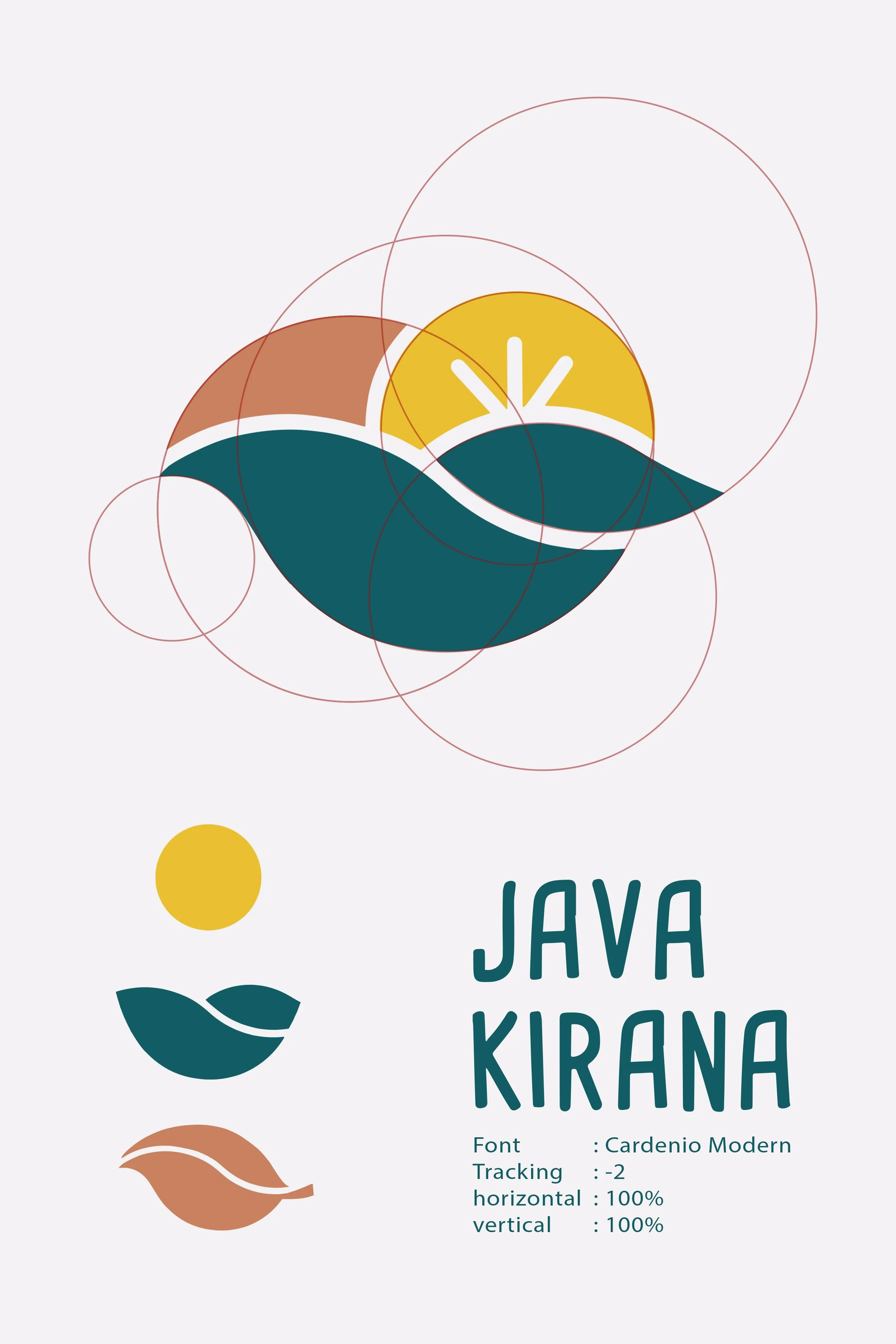
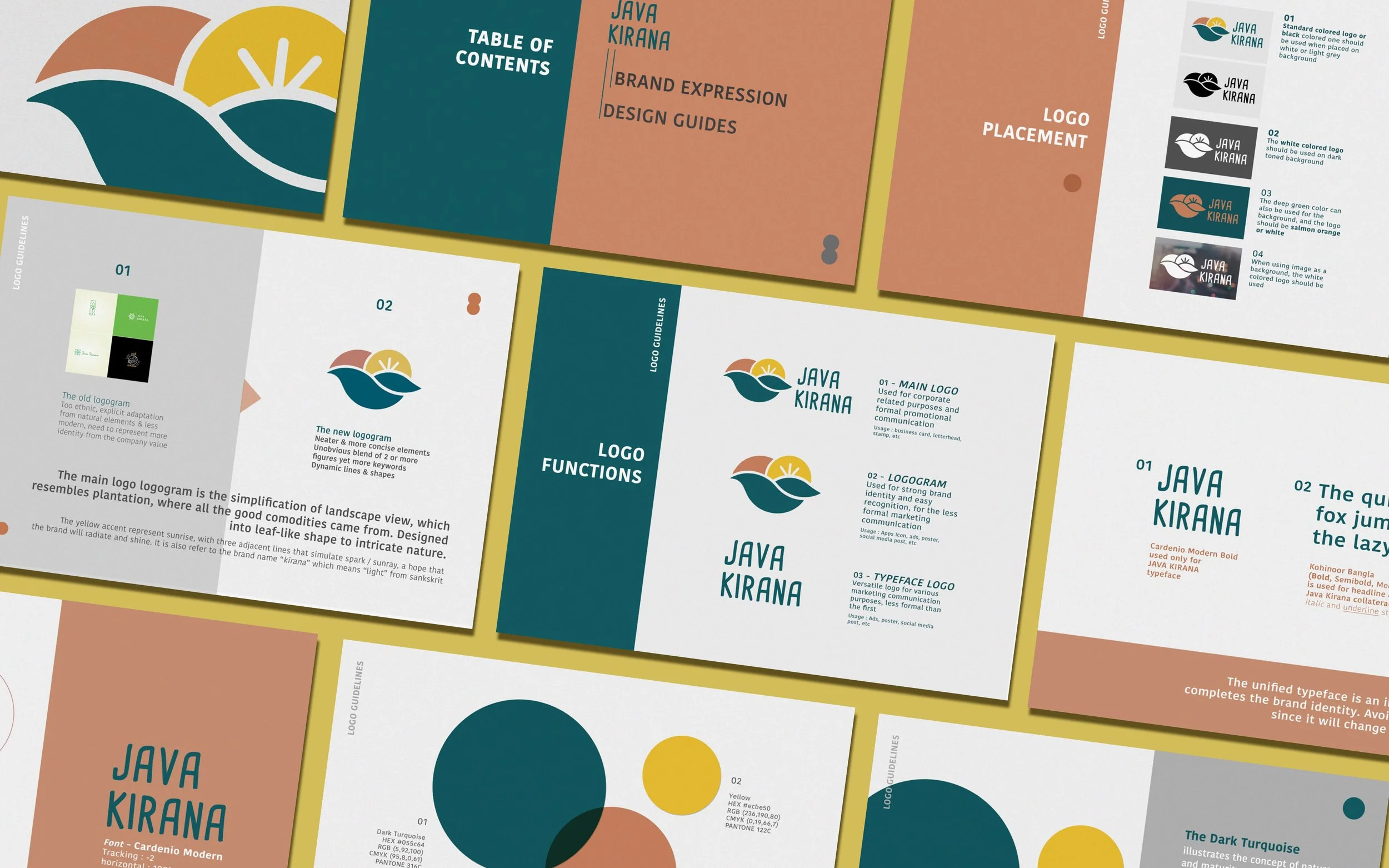
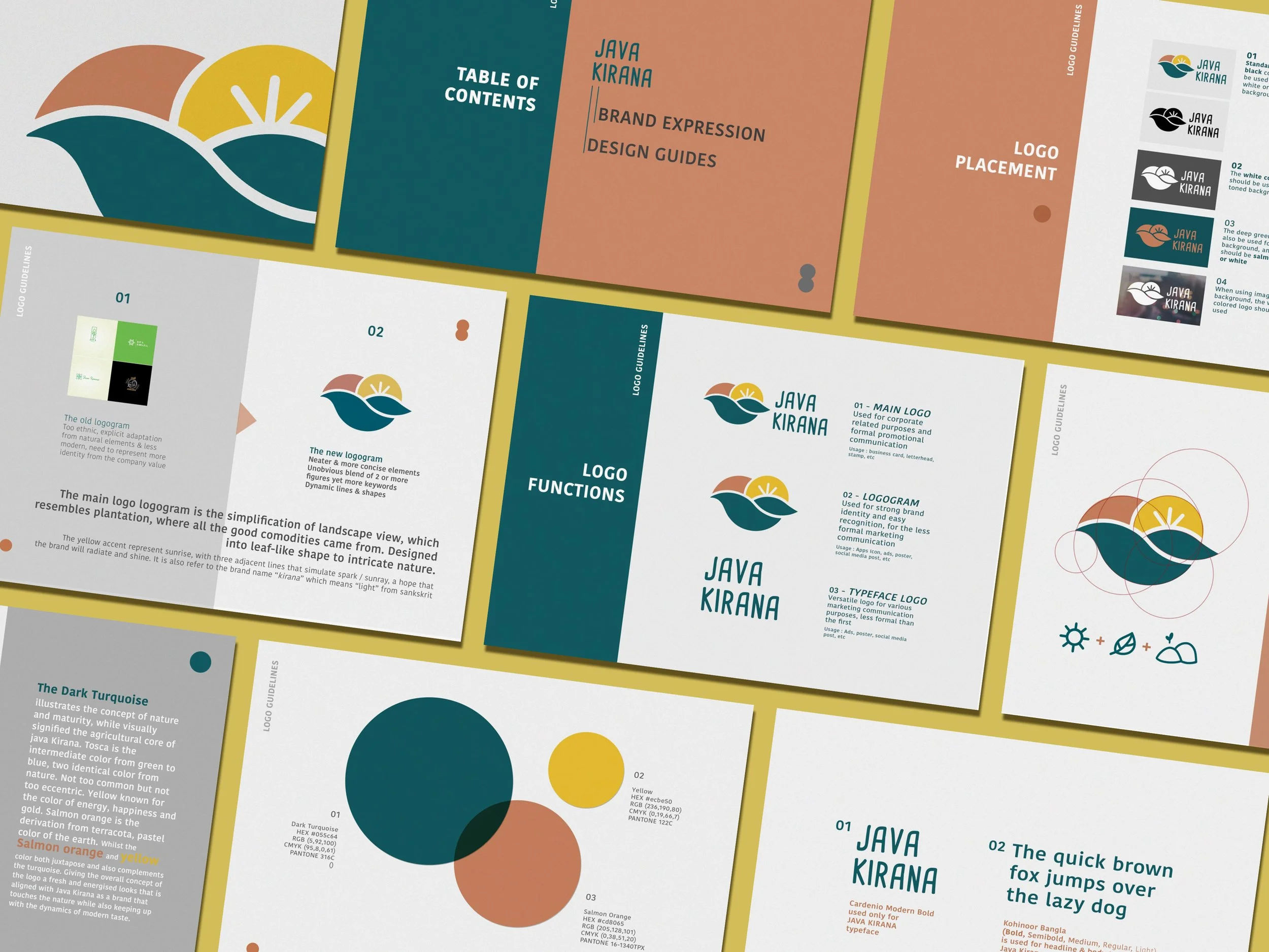
The logo is a bold yet organic emblem, constructed from three distinct elements that seamlessly blend into one unified form:
The Sunrise rendered in bright yellow, it emerges behind the horizon, symbolizing hope, new beginnings, and the company’s forward momentum, especially in supporting farmer livelihoods and elevating coffee quality.
The Landscape represented by fluid teal shapes, forms the base of the logo. It symbolizes the rolling hills and coffee plantations of Indonesia, grounding the identity in its agricultural origins.
The Leaf Form integrated within the flowing shapes, reflects Java Kirana’s deep respect for nature and sustainability. The organic curves and clean lines embody growth, cultivation, and care.
This balanced composition tells a visual story: from soil to sunrise, from farm to future.
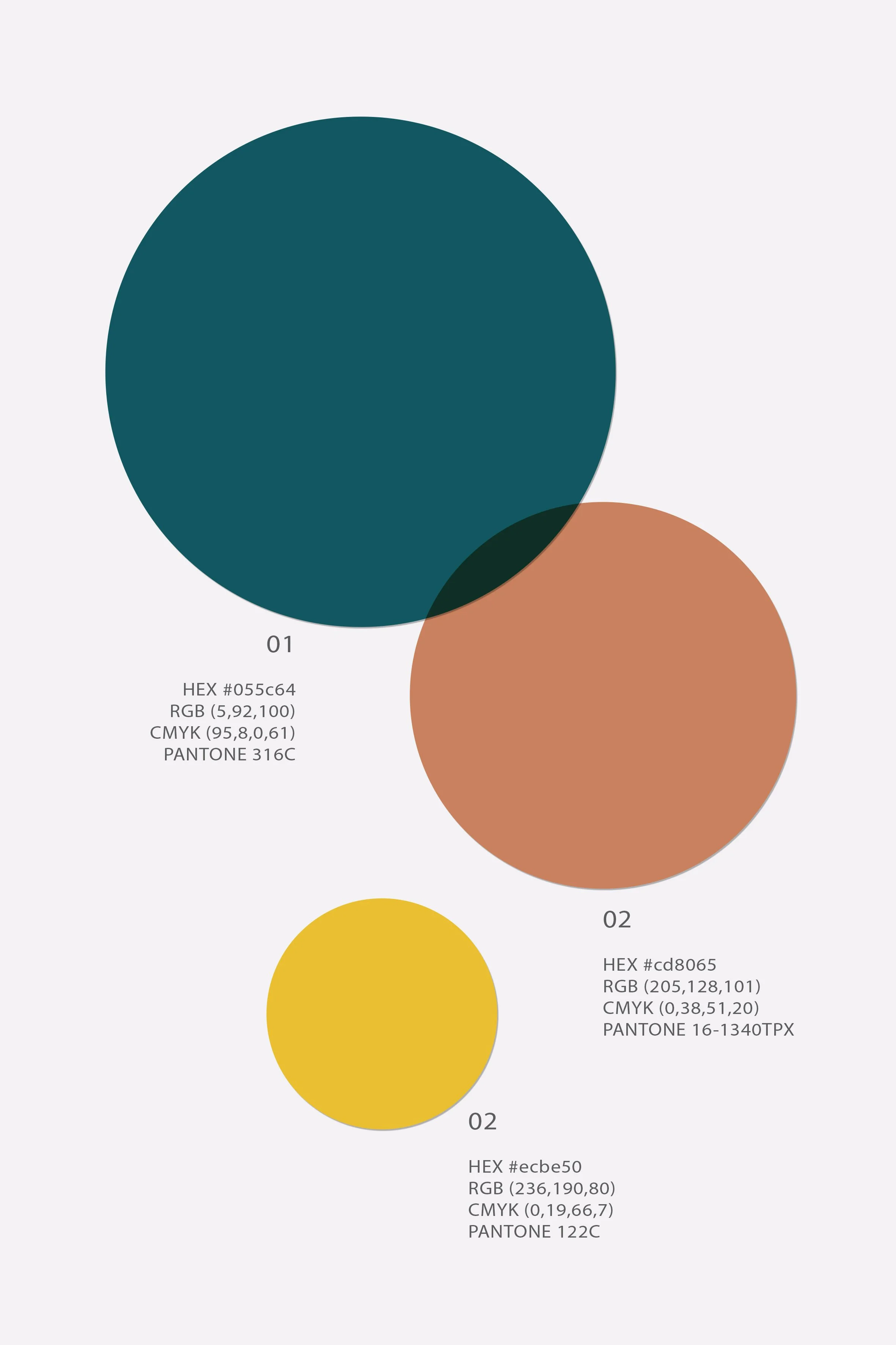
The color direction helps the brand stand out in the coffee industry, appealing to modern consumers who value freshness, ethics, and visual clarity.